I like the colorful stuff. While other people would prefer neutrals or hues that aren’t turned up to 11, and while my favorite color is the safest, most popular one in the world, I don’t discriminate. I welcome the possibilities of each speck in the spectrum. (Although navigating the tints and shades of orange is the trickiest in my experience.)

The thing is, while I wanted to delight in the candy colors from the iOS 7 icons, appreciate the playfulness and liberty with which they picked those paint chips from the hardware store—their sloppy design and way of competing for your attention all at once feels unsettling. If everything tries to pop, do they catch your eye or just blind you simultaneously?
I can name three iOS apps that use colorful gradients not just as decoration, but in executing a stunning interface experience: Solar, Rise, and Songza. You can even throw in Clear and Brisk.

Rise app

Songza app
I wonder why those icons couldn’t be like that. Both approaches strive for simplicity and clarity, but one of them lacks the sophistication and polish they’re supposed to be renowned for.
Is it unfair to compare the look and feel of a whole app versus an icon design? Ok let’s talk Android. Two icons had caught my eye before: Google Currents and Google Play. When iOS 7 went public, I wished Apple had gone that route. They’re bright and colorful without giving you a virtual toothache.
I’d say I wish Google did too, but if you put them with other products from the family, those pastels and gradients are now looking out of place, and there’s a reason for that:
It wouldn’t surprise me if they are due for an overhaul, as one of the core principles in the Google design language is to incorporate the brand’s primary color palette. Which they’ve actually implemented quite well.
The icons from Project Kennedy are just about as toyish as the ones in iOS 7—the Lego to the Lisa Frank, if you will. But they still appear to be more carefully considered and cohesive.
If I had my way though, I’m totally on board with this remix by Matt Rossi (yes, the same one I mentioned in the footer as an inspiration for this current iteration of Stellify). So, when are pastels gonna make a comeback?
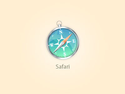
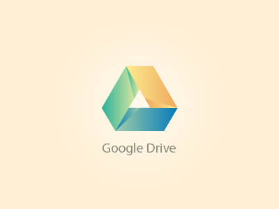
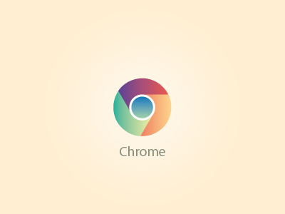
Safari, Drive, Chrome icons by Matt Rossi