While exploring unicode symbols, I discovered that the three-bar icon people now see as the hamburger menu also exists in the symbol table as something called the “trigram for heaven” ☰.
It’s one of eight signs in Taoist cosmology, called the Bagua or Pa Qua, and found in the I Ching. If you’ve seen an octagon-shaped piece of Chinese decor with several dashed lines, usually around a yin yang symbol, those are actually the trigrams in a bagua diagram, either in “Earlier Heaven” or the “Later Heaven” arrangement.

Besides ☰, which represents heaven 天, we have ☱ for lake/marsh 澤, ☲ for fire 火, ☳ for thunder 雷, ☴ for wind 風, ☵ for water 水, ☶ for mountain 山, and ☷ for ground 地.
The bagua diagram is used everywhere, from astronomy to anatomy, including feng shui. Each one also corresponds to other symbolic categories, e.g. the heaven trigram also means: the Creative, (natural) force, northwest, father, head, strong / persisting, creative, and horse.
Notes on implementation
So jumping back to design & development: the other trigrams and their concepts might just be interesting enough to spark some alternatives in your work, like how the “hamburger” metaphor has cooked up kebabs, doners, bento boxes, and meatballs:
Don’t ever say you don’t have choices on mobile. pic.twitter.com/Atu3Ogi58j
— Luke Wroblewski (@lukew) April 23, 2015
And other tasty treats like cookies and cakes:
Menu Icons ? pic.twitter.com/4detdj98AC
— Alex ? (@alexmuench) January 30, 2019
As a unicode symbol, it might not render in super old devices. A safer bet would be the similar-looking mathematical symbol for “identical to” ≡.
Read more on accessibility issues here.
You can also flex with CSS shadows or gradients. These days, an SVG image is usually the way to go.
Not so universal meaning
But all these have the standard reminder that icons alone, unlabeled, aren’t always more understandable on their own, and other cultures can interpret them differently. Here’s what happened to Amazon in India when it came to graphically representing search, or the idea of adding to a virtual cart:
To make its screen easier to understand, Amazon added icons for books or electronics or beauty products. When it figured out customers didn’t know the magnifying glass was a standard symbol for search—some were calling it the ping-pong paddle—it added pop-up descriptions and recommendations in Hindi.
Then there’s the “Add to Cart” button. “It is not just about the translation but about the mental model of dropping something into the cart,” said Zahid Khan, senior manager of customer experience at Amazon India. “There are lots of places in India where customers have never even seen a cart. We might have to change that into ‘bag.’”
And here’s what the Japanese government is changing for the tourist influx at the Tokyo 2020 Olympics:
![]()
The symbol could be misinterpreted by foreigners as the mark of a restaurant that serves hot food. To avoid confusion, three people have been added to the onsen symbol, to clarify the fact that the image is used to represent hot spring bathing.
Update: there was some backlash from the locals about this, so the Japanese government announced that both new (ISO) and old symbols would be OK.
What’s in a nickname
If you jump back even further: 30 years ago the three-line icon was already around, but there was a different nickname for it: the “air vent” icon. And it worked well as a pun, because the UI consisted of windows:
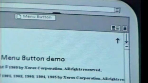
“At Xerox we used to joke with our initial users that it was an ‘air vent to keep the window cool’,” says [Norm] Cox. “This usually got a chuckle, and made the symbol more memorable and friendly.”
— BBC News
So now we have at least 4 different sources for the metaphor:
- Hamburger 🍔
- Heaven ㆝
- Mathematical equality ≡
- Air vent 💨
Imagine how much things in design and technology would be different if time or influence were tweaked just a bit. We could’ve been calling it the “heaven menu”.